As technology’s influence in human life continues to spread its roots in every sector, its demand and standard for an aesthetically pleasing and contemporary user interface (UI) or different interface designs in the healthcare space also continues to evolve.
Ranging from different kinds of designs and gestural controls to long-form content scrolling, healthcare professionals, and patients’ expectations for medical devices are also getting influenced by the UI trends seen in consumer products.
Unfortunately, many of the contemporary Interface trends on the consumer’s side do not satisfy safety-critical applications in the medical space. An incorrect button pressed or an overlooked header typically does not cause any dire consequences; However, such use errors in the medical space can result in unapologetic harms. One study showed that infusion pumps account for up to 35% of medicinal errors that result in significant harm.
A large percentage of those errors were attributed to poorly designed user interfaces. These preventable harms are often the result of human error because of device complexity or difficult interface.
We have highlighted below 5 “musts” tips and techniques for both contemporary and safe medical device interfaces to address this topic.
1) Use Simple Language
The first and the foremost thing one should pay attention to is to use simpler and understandable language so that the consumer may not suffer many difficulties in handling the device. The interface designers should keep the mindset about the increasing number of patients and caretakers using these devices at home despite not having extensive education or training. Today, the designers are advised to simplify communications for healthcare professionals and common people.
Overly complex words and phrases often characterize medical device user interfaces. Even though the medical workers consistently opt for a simple language preference, product designers often write in a technical manner that can be less than user-friendly. The interface designers should keep the interface simple.
The best interfaces are almost invisible to the user. They avoid unnecessary elements and are clear in the language. Specific corrective measures include writing shorter sentences (1/2–2 lines) and paragraphs (2–3 sentences), using meaningful headings and subheadings. This makes things simpler without dumbing down the user interface.
2) Strategically Use Color and Texture
It’s up to you whether you wish to make your content eye-catching or repugnant. Proper use of color, light, contrast, and texture results in both cases.

Experienced designers suggest limiting the color palette of a user interface between three and five colors, including shades of gray. This is their major preference for background and major on-screen components, while one-of-a-kind and small-scale elements may feature additional congruous hues.
A user-interface designer should also select colors carefully to be sure they are consistent with medical conventions. For example, red is commonly used to depict alarming information or to communicate arterial blood pressure values, and various secondary colors are associated with certain drugs and gases.
3) Use simplified typography
Carefully look up to how you use the typeface. Different sizes, fonts, and arrangement of the text helps increase scan-ability, legibility, and readability of the texts or contents for the consumer, thereby making ease for them to understand.
An efficient user interface is based on typographical rules that point towards the most important information and make screen content easy to read. To achieve these, one should commit to a single font and just a few character sizes such as 12-, 18-, and 24-point type. While characters should vary in size, the sizes must not be so disparate as to create a tense visual contrast.
Another way to simplify typography is by eliminating excessive highlighting such as underlining, bolding, and italicizing. Because many computer tools have developed, making it easy to highlight text in these ways, overuse-resulting in havoc. Usually, a single method such as bolding is enough to highlight information effectively when used in context with different font sizes and extra line spaces.
4) Eliminate Inconsistencies
By using common and simple elements in your UI, you can make your users feel more comfortable and make them get things done more quickly. It is also important to create patterns in language, layout, and design throughout the site to facilitate efficiency. It could be confusing and annoying at the same time for the user if they get inconsistencies (for example, using the color red for both critical and non-critical situations).
To prevent such design inconsistencies, a style guide should be created and maintained. Standard graphical user interface (GUI) guides like Microsoft’s User Interface Design Guidelines for Windows 95 and crank software storyboard are useful prototypes for style guides specific to medical devices.
Why Crank Software?
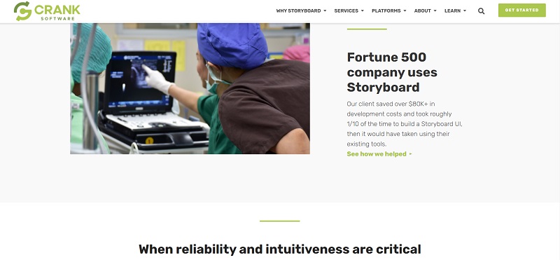
Medical GUI designers and engineers trust Crank Software’s Storyboard to easily create optimized GUIs for embedded devices. Storyboard is built exclusively for creating UIs for embedded products. Whether it’s a portable monitor, infusion pump, or robotic surgery system, their UI development tool, Storyboard, is trusted by designers in custom medical UIs where high-reliability and ease-of-use for the operator are critical factors.
Storyboard connects UI designers and developers in a productive, parallel workflow that accelerates the design and validation of high-performance, reliable user interfaces on low-power, low-cost platforms. With a storyboard, you can create an embedded application from start to finish in a few minutes.
Earlier this year, Crank Software helped in fighting covid-19 by enabling Ventec Life Systems to increase ventilator production. The rapid GUI development capabilities of Storyboard made the addition of new functions to VOCSN critical care ventilators possible in under 30 days.
5) Reduce Screen Density
A lot of medical device displays look overstuffed with information due to which few empty spaces remain. Such space is important in a user interface, as it helps to separate information into related groups and provides a resting place for the user’s eye.
Overly dense-looking user interfaces can be initially intimidating to nurses, technicians, and physicians, making it difficult for them to pick out specific information at a glance. For such reasons, what the design engineer does not put on the screen can be as important as what he or she does put it on. To eliminate excessive information, the user-interface designer can:
- Present secondary information on demand via pop-ups or floating notifications on the screens.
- Reduce the size of graphics associated with the brand identity (i.e., logos and brand names)
- Use simpler graphics (e.g., replace 3-D icons with silhouette-styled ones).
- Use space instead of lines to separate content.
- Reduce the amount of text by stating things more simply.
Once a user learns how to do something, they would transfer that skill to other parts of the site. So medical devices must be more intuitive and easier to use. Medical device user interface designers must aspire to excellence. The success of most medical devices is closely linked to user interface qualities. The tips mentioned earlier can help the designers build a user-friendly UI and help enhance the country’s medical facilities.