There Are Advisable Sizes, But It Ultimately Depends On You
The question is: how do you develop your online exploits? Do you prefer to be in one spot, do you move around a lot? Some people want to be mobile, other people won’t get any work done except from a desktop device. Some people switch it up. So what are your preferences? Figure those out.
In the meantime, here we’ll explore a few of the proscribed best practices of web developers regarding screen size and resolution. Some of these things may or may not apply to you; provided you understand where you’re coming from initially, you’ll find the best possible options for the situation defining your day-to-day. Remember: give your eyes a break at intervals.
What Can Your Eyes Stand?
Here’s some good advice: it’s better to have ratios defining windows with which you work on a screen be small, than large. The smaller, the better—but your eyes may not be in a place where they can stand such small shapes and moving pictures. So what do you do? Well, work with what you have where you are.
A larger screen allows you to have more small windows that can be used to complete work. Notepads, word processing portals, videos on sites like YouTube, social media, Instant Messaging (IM) apps—you may well have to have work windows for every single one of these items. Smaller screens make it harder to put them all in a visible spot simultaneously.
So ask yourself what your eyes can stand, and how can you get the most work done with the least amount of difficulty while keeping your eyes a healthy distance from the screen?
Focusing for long hours on big windows will reduce ocular capacity to see small things a long distance from where you stand. In a phrase, you’ll get more “near-sighted”. For your own health, it’s important to seek higher resolutions.

What Portability Do You Need? Typical Sizes Are 14” To 17”
Many web developers, programmers, data entry professionals, and content creators favor operational mobility for what they design on a given computer. Others don’t. If you’re going mobile, your likely screen range will be somewhere between 17” and 14”; with an emphasis on the smaller size—here’s a complete guide on 14” screens.
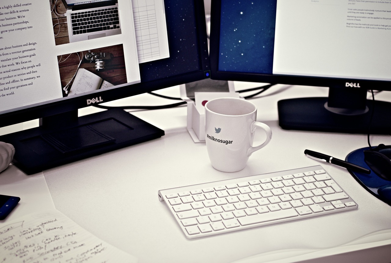
If you’re staying at home, a better move might be to use two separate screens and a desktop computer with a large tower. You plug the second screen into the desktop tower and put it to the left or right, whichever is convenient.
Do You Know Specific Resolution? 1920X1080 Is Advisable
We’ve said a lot about resolutions here—what’s the specific basic threshold you should look for? Well, it’s going to be about 1920X1080. Now, most machines these days allow for variable resolution. That is to say: you can get increased or diminished resolution based on settings options on your device.
That said, some computers are more able to produce stronger resolutions than others. If you go with a larger resolution on such devices, they may not function properly. Look for a device, regardless of screen size, that can at minimum reliably sustain a 1920X1080 resolution. To that end, many Apple devices answer the call well; but they’re not alone these days.
How Many Work Windows Do You Need Open Simultaneously?
It was mentioned earlier that you would likely require a multitude of work “windows” open for best results overall. That’s going to depend on the sort of web development you’re involved with, and your particular working style. If you don’t need as many windows open, and your eyesight is good, you might be able to be productive with only a small screen.
Understanding Actual Needs To Make The Best Choice
Whether you work more productively with big screens or small screens may in large part depend on your specific preferences. Sometimes your style may recommend a small mobile screen with a medium resolution. Sometimes you want more deeper resolution across two monitors, and you will do better if your work is “stationary”.
It depends on you. Consider how many work windows you’ll want to have open, understand what your resolution needs are individually, keep your vision’s acuity in mind, and be sure to factor in portability. Between these categories, you should be in a better shape to determine the best possible screen solutions for web development.